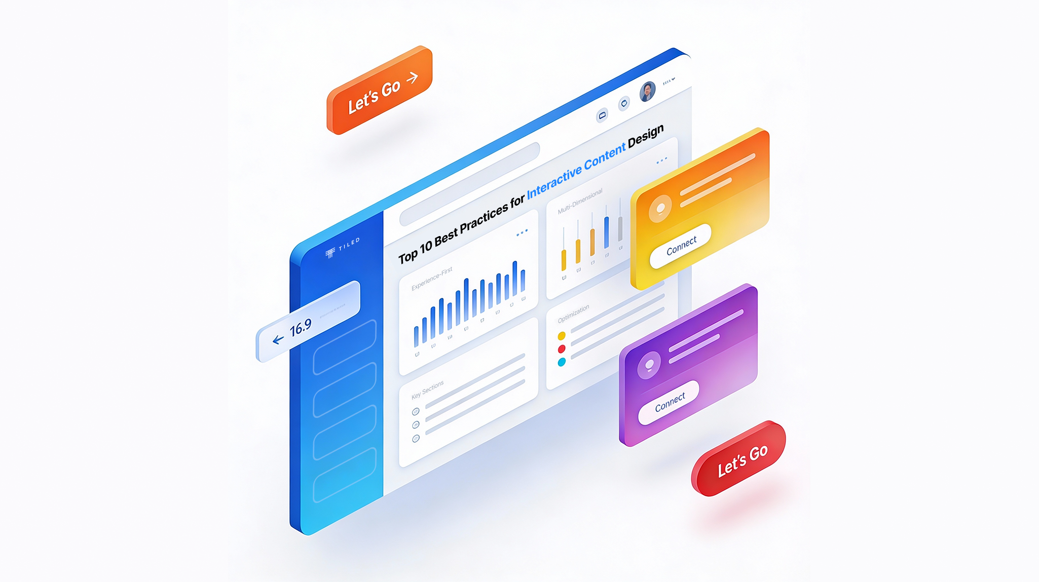
It used to be that documents were fixed. The words didn’t change, the reader had to follow a single path through the text, and there was no way to change it based on the different needs of different people who might be interacting with it. But today, that’s all changed. Interactive or dynamic documents, ones that dynamically respond to their readers, can be found everywhere from sales brochures to pitch decks.
The difference between a static and dynamic document is similar to the difference between a video rental store like Blockbuster (ask your parents what those were) and a streaming site like Netflix. In the first, each consumer enters the same space, which has the same titles to rent organized into a fixed taxonomy — comedies are in one place; dramas in another. In the second, each consumer is presented with content customized to their tastes and presented in categories tailored to them (you can find their category ID Bible here). Even better, a viewer can easily jump from place to place, instead of walking through a predetermined path through the physical store’s aisles.
Although it’s true that writing a dynamic document comes with its own challenges, it’s a far from insurmountable task to build one. Here are some design tips to help you think through what you should do the next time you’re creating an interactive document.
It may be counterintuitive to start by thinking about the whole document first, rather than the individual parts. But often the most important step is to think about the whole thing.
The scholars Eva Lenz, Marc Hassenzahl, and Sarah Diefenbach developed an approach to designing interactions that focuses on linking together why and how. They suggest that you should think first about why a person would be interacting with a product before turning to the particulars of how that interaction will happen. To connect the two together, they offer a series of questions you can ask about what you want that interaction to be. Some of them include: Should the interaction be slow or fast? Approximate or precise? Gentle or powerful? (You can find the full list of considerations here.) By answering these questions first, you can create a document that feels unified, even while readers follow their own separate paths through it.
Let’s say you’re creating an interactive brochure for a newly built apartment complex. Why would someone want to interact with what you’re making? Probably because they might be interested in renting an apartment. What should they feel when they interact with your document? It’s likely they would want something that feels fast and precise, but also gentle. You can use that to guide your design decisions when creating the document.
Once you’ve thought about the hows, you can move on to the whys.
In physics and chemistry, atoms combine into molecules. (We’re trusting you already knew that.) When designing an interactive document, it’s much the same. Individual pieces of content, like photos, data, and snippets of text, will combine into larger units that a user will interact with.
The design writer Eva Schicker suggests keeping those atoms as simple as possible, and as distinct from each other as possible too. “In UI design, we take one atom at a time and assign it a unique property, such as button, label, text field, and others.”
Let’s stay with our example of that apartment building. In that case, your atoms would be information about the building, like exterior photos, floorplans, and details about amenities, as well as navigation tools and the elements of your brand identity. Maybe a person is interested most in what the building looks like. Maybe they’re really interested in a map of where it’s located. Your job is not to anticipate which atoms are most important to them, but rather to lay them all out in a way that any person can easily find what they’re looking for. It’s even possible to surface information selectively based on user preferences, so, for instance, someone who checked a box saying they had a pet would see information about the dog park around the corner.
The whole is different from the sum of its parts. That’s the central insight of Gestalt theory, a psychological approach developed in the 1920s and later adopted by designers. Although its application to static content is well understood, it’s less common to think about how to apply Gestalt theory to dynamic content. Drawing on Gestalt theory, the artist and educator Lisa Graham has proposed new ways to design interactive documents.
She suggests that when you’re designing dynamic documents, to pay close attention to how things fit together, using concepts like contrast, proximity, closure, similarity, and continuation. For example, the more similar that elements like links, videos, or animations display, the more a person will naturally tend to perceive them as belonging to the same group.
In the case of the interactive apartment brochure, think about which parts belong together and which you’d like to keep separate. For example, you probably don’t want the legal boilerplate to be nestled right up against pictures of the roof deck.
The use cases for interactive documents are as wide-ranging as the content within them. But that doesn’t mean they should be difficult to wrangle. Using this approach as a guide, you should be well on your way to creating an interactive document that is as dynamic as it is useful.